5 Web Design Strategies Sure to Make You Look Good
April, 2020
The design of a website is critical in business today. You want visitors to like your site, stay there for the longest time possible and do whatever you want them to do — read, share, buy.
Web page design is not only related to image placement, fonts and colors. The look and feel are critical, but there is more to design than that, like usability and functionality.
There are a bunch of different website builders used to design and develop sites. As technology and software develops you will have to learn new trends, adapt to diverse requirements and also make peace with making a lot of mistakes. With experience and through trial and error, you’ll learn valuable insights on how to design a high-quality website with a superior look and feel.
Top 5 Web Design Principles to Help You Create the Best Websites
1. Mobile-First
A web page looks on great your big 30-inch UHD 4K 160Hz gaming monitor. But many people will access it from 10-inch tablets or 6-inch display smartphones.
Desktop navigation is losing its dominance and everything is becoming mobile-oriented. This approach to designing for various screen sizes and different devices has a two-word name: responsive design.
Google prefers responsive sites and its algorithm favors those types of websites. Google has recently taken to mobile-first indexing, which means if you build a website that hasn’t been designed for responsiveness it’s unlikely to be found by Google crawlers. The result, your website won’t be found online as there will be zero search-ability and visibility.
Statista showed that mobile devices are responsible for 51.65 percent of web page views worldwide in 2019:
Websites built with responsive design look good on diverse screen sizes and the features work fine across both the desktop and mobile versions.
So it would be best if you double up your checks here. First, check the aspect in multiple screen sizes and second, check if everything works as expected.
2. Be Careful With Multimedia
Videos and images play a significant role in the performance of a webpage.
If you have a lot of high-resolution images and videos, your website can become slow. And slow is terrible for your business. What did you do the last time you visited a slow website? I’m sure you left and searched for another one.
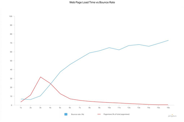
According to a Pingdom study, the percentage of visitors who leave increases after three seconds — reaching 38 percent if the loading speed is 5 seconds.
You can see the bounce rate (blue) in the following graph. Pageviews (red) also diminishes when loading speed increases:
You need to be sure of what type of content is strictly necessary for your page and do your best to avoid high-resolution images and videos.
For example, if you need to have many review videos. Then it would be best if you use a third-party video hosting like YouTube, so the user experience is not affected. Also, if you need to have high-res images, then you can try compressing and optimizing them. That way, you avoid large file sizes and reduce traffic consumption.
3. Above the Fold or Below the Fold? That is the Question
You need to organize the information on your website in a way that makes your visitors want to stay. And this is when the concept of a fold is crucial in the designing of a web page.
Above the fold refers to the information that appears on the screen the first time the website loads. Or what is also referred to as the section of the page that a user can see without scrolling.
The lower the element is, the harder it is for the visitor to see it. It would be best if you were to offer the most relevant and attractive information above the fold. So that users have the best possible first impression. Buttons that are a call-to-action (CTA) need to be visible at first sight. For example, an “Add to cart” button should be visible to the customer, so they can’t ignore it or so they can easily find it when ready to purchase.
So, you placed all your critical information at sight. Now, should you avoid the scroll?
Of course not, scrolling is necessary for web page design to show all the content of a page. What I can tell you is that you need to put critical information above the fold (buttons for transactions, CTAs, forms, etc.).
Below the fold is the place where you can expand on other business information.
You can see an example in the DJI store web page:
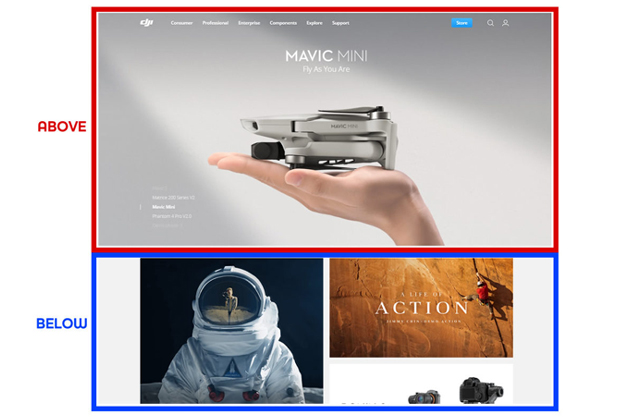
DJI shows the navigation bar and a slider of his main products all over the front page. But if you want to know more, you can slide below the fold to check other stuff (less critical).
There are no standard practices to do this. However, you can test how your page looks on different screen sizes and then modify it accordingly. Also, you can use software like scroll maps to check it more quickly.
4. Avoid Visual Noise
Your website doesn’t need to have all the information, images and videos on the front page. Having a ton of content on the main page generates visual noise.
If you try to put many images on the cover of your website your page could look like this:
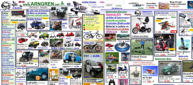
It looks like a mess, right? Well, it is. How do you solve it? With some sense of organization. Organizing the content may take time because you need to do considerable testing. But it is an essential web design principle to take into account to achieve great usability.
You need to avoid burdening your page with the stuff that distracts or confuses your visitors. For example, look at eBay main landing page:
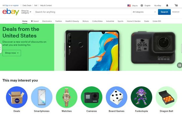
Perfectly balanced, as all things should be. You can see that they show few products on the main page (most popular or most sold), so they optimized a lot of space. If visitors can’t find what they are looking for, they leave. According to a study from Google, most users judge visually complex websites as unattractive and they expect simple ones. This study also takes into account prototypicality — how representative an object is of its category. For example, a Ferrari F1 vehicle is an excellent example of a racing car — if I mention the word racing car, it is highly probable that you will associate it with that vehicle. You can see in the following graph how this relationship between complexity and beauty behave:
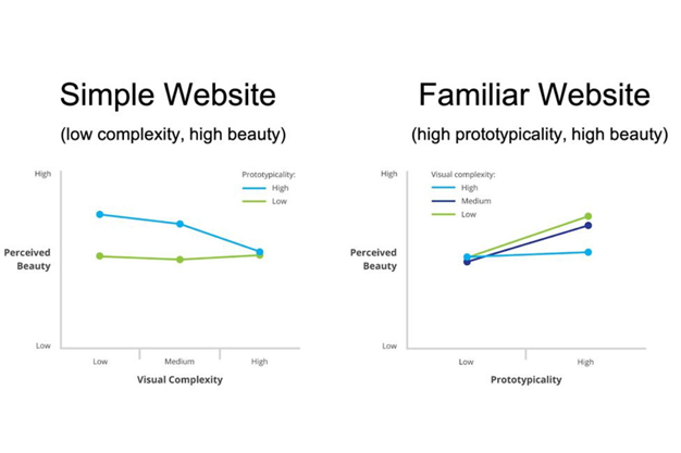
As you can see, people like simple websites with low visual complexity and also they notice more beauty if the sites are familiar with high prototypicality.
So be smart, be simple.
5. Design With Content in Mind
You may think that as a designer the copy content isn’t your business. After all, designing is about element placement and templates, right? Wrong. Thinking about content when designing a website helps to make sure that it looks good no matter the text sizes, fonts and styles. Considering the content only after designing the website can lead to a site that looks messy, disorganized, or even incomplete.
Also, websites don’t need to be digital brochures. Engaging with your audience and interacting with visitors via the content has many benefits that’ll help your business.
Here’s what to expect if you include interactive web copy:
And also, remember to link your blog with social media. In that way, your business will be positioned in front of your buyers and their feedback will help you improve.
Learning how to design a website may seem challenging. If you follow these brief web design principles, you’ll end up with a good-looking, functional and successful website.
Remember that your design should work across all devices and Google practices mobile-first indexing. Make sure to use the necessary amount of images and videos. Show your crucial information first. Be simple and straightforward.
And last but not least, think about content and make sure it looks good on your site. A blog also will help with feedback and interaction with your audience.
After doing that, you should see the numbers move up, but be patient and keep researching for tips on best practices and improvements.
Also read: 6 Reasons Why Instagram is Good For Business
Back to All Internet Marketing Resources, Articles, Tips, Tricks
Get in Touch today
Share This:
Know More Information About Web Desining Agency in Thane Mumbai Contact Digikraf- Best Digital Marketing Company in Thane, On +91 82913 44001 Or Email Us At info@digikraf.com
Source - www.seoblog.com

